
How we designed our player for The Hearth and Harbour
Hello readers!
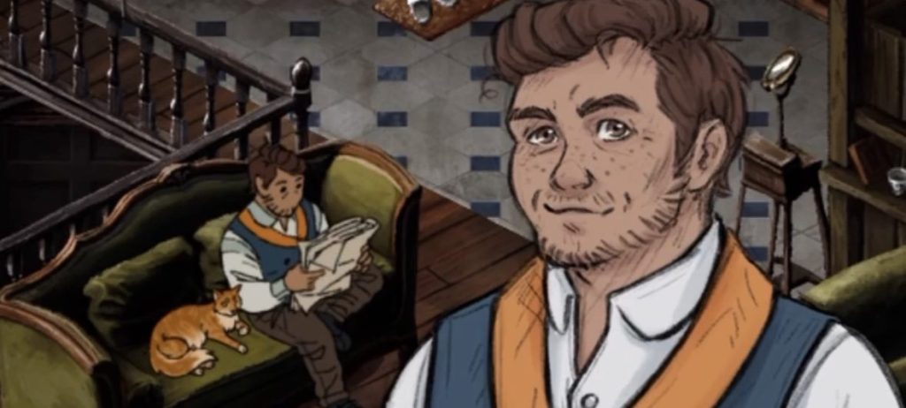
Last week I posted a cheeky little video about our player character, Kit Purcell, being hot. I asked if there was interest in a deep dive into their character design and one person said yes, so here we are!
Early in the design of The Hearth and Harbour, it was decided that we wanted players to be able to explore the city. The best way to create a sense of place and immerse players in that place, was to let them mosey around and interact with it at their own pace. For this, we needed a controllable character. For that, we needed a character design.
Our previous game, The Pale Beyond, had a player character-ish. Players take on the role of Robin Shaw, but we never see Robin or what they look like. They were faceless, genderless – we deliberately obscured their portrait in the crew manifest so that players could project themselves into the character. Once the game came out, this created a lovely unexpected thing in the community – people designed and made fan art of what they imagined their version of Shaw to look like. (Shawsonas!) They’d roleplayed so hard they had created an image of their own Robin Shaw in their heads. The range of different Shaws was amazing!
This was wonderful, and not something I wanted to jeopardise in this next game by creating a boilerplate ‘guy’ they were forced to use (foreshadowing is a literary devic-). So, I started by looking at customisation. I wanted to figure out what was important for players to feel represented, and also what was useful for role-playing and world-building in the character. At this point we knew the player ran a restaurant, and the design had to be reasonable to hand-animate in 8 directions so they could navigate an isometric environment and not break our art style, but everything else felt flexible.
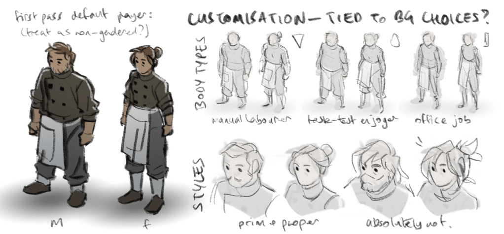
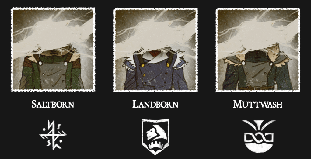
I thought about how we handled character creation in Pale – a series of choices about your background and experience – and tried to come up with ways to show them visually. This game was set in the same universe as The Pale Beyond, so while the location and tone was a little different, many of our ideas from the previous game could be applied to this one. We’d created cultures like Saltborn and Landborn, design elements like the shoulder cut outs in all the clothing – things that could ground the character in the setting, while other variables like age, skin tone or gender presentation could give players something to see themselves in.
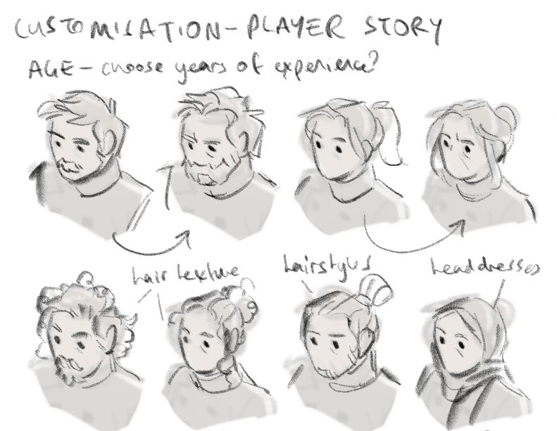
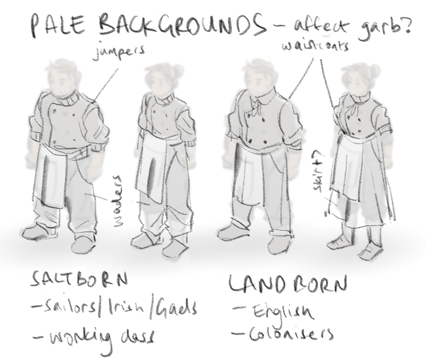
trying to figure out what interesting customisation options would be for a game set in Pale’s world
Then, towards the end of pre-production, development was thrown into chaos. People were off sick, we had to move offices suddenly, and the local industry support for games started to buckle. With multiple setbacks (including months of working from home with weekly meetings in a room above a friend’s pub), it became pretty clear that some design choices for the game were… aspirational. It’s important to acknowledge when real life external difficulties put pressure on a project and you have to change course to improve your chances of ever reaching the finish line. You may not make the thing you originally wanted, but you can still try to make something! Hopefully it’ll even be good!
We pulled back on character customisation, and though it was less labour in the long run, my task suddenly became a little harder. I now had to create a boilerplate ‘guy’ to force the players to use 😦 This also changed the game design slightly – moving from a malleable player character to a defined one changes how the players engage with it, even if we let them choose everything else about them. Now we were giving them someone to inhabit, as opposed to them being themselves or someone they had shaped. This meant we could give Kit a little more of their own story, but they still had to be someone players could relate to, and see themselves making decisions through.
By this time, more writing had been done, and the brief had expanded a little. We now knew Kit Purcell was:
- warm and charming,
- in their 30s.
Well. It was a start!
When I designed The Pale Beyond characters, I did so mostly from scratch. They had a role in the crew, some of them had a bit of a personality or backstory, but the rest was left up to me. I adored this. I love character design as a process of getting-to-know someone, teasing out their traits and quirks and presenting them visually in their physical appearance.
But no one I designed for Pale was a player character, they were all fully their own people. The player didn’t have to relate to them, or even like them at all. We were hoping they would have different feelings about each and every one of them. Now, in The Hearth and Harbour, though Kit could have their own thing going on, they were still the character that players would be roleplaying through. We wanted players to feel like they could project into them, and empathise with the choices the game presented them with.
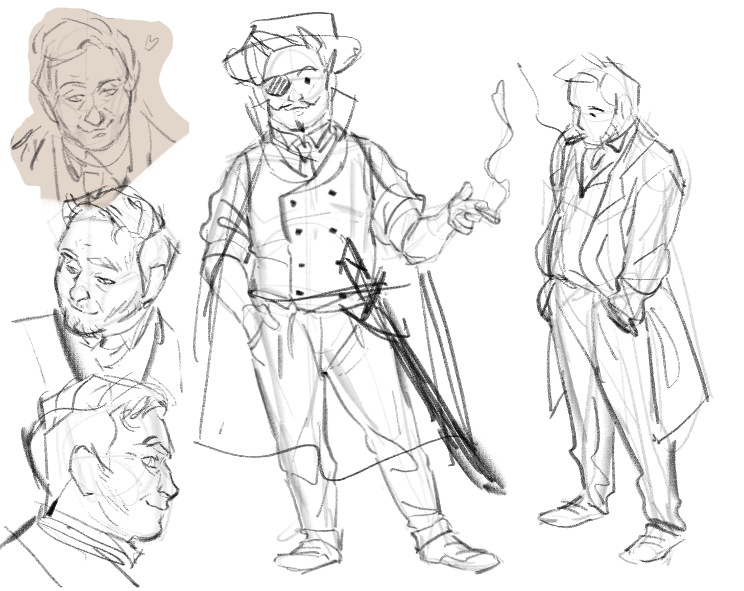
It was even worse that Kit was also supposed to be handsome. It’s a challenging tightrope – to make someone both handsome and interesting-looking (and also relatable!!!!). At this point I was still determined to have at the very least, a masculine and feminine Kit, so I clung to that idea and on I marched.
Not fully sure where to go, I fell back on old faithful – research! I looked at contemporary art, especially an artist that was influencing artwork elsewhere on the project, Leyendecker (that man knew handsome). I looked at actors from the time period, what would have been considered attractive in the 1910’s, what people valued in appearance (clean-shaven, slender, pale with well-kept, dark hair). I looked at chefs (often scruffy, always incredibly stressed but somehow cool-looking at the same time). I was looking for interesting ways I could combine these elements. I was looking for rules I could break.
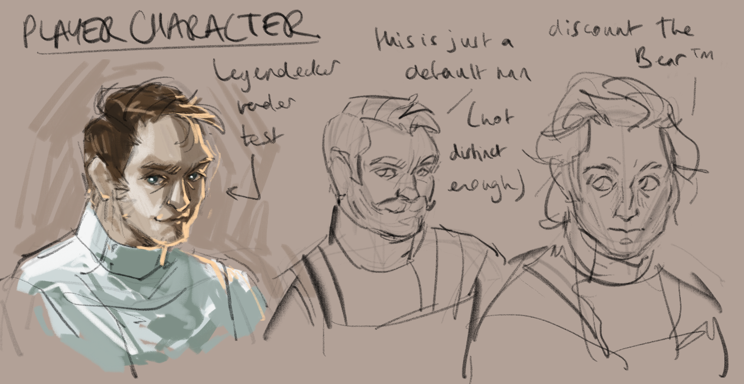
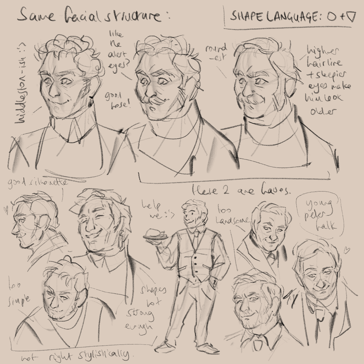
my first attempts at trying to get a hold of who Kit was – you can see a few actors sprinkled into the faces
Finding young Peter Falk (the actor who played Columbo) was a turning point. He wasn’t 1910’s, but he had something about him. Handsome but not boring to look at. I felt pretty strongly he had a warmth to him, but also an element of mischief. Mischief seemed like an edge I could add to both offset and enhance Kit’s charm – and would probably be fairly reflective of how many players would engage with the game, so (hopefully) wouldn’t create any dissonance.
I took those vibes and ran with it – trying to find them in pose and body-shape. I drew through what the player might be doing in the game, digging the character out of the feeling of what they would be playing day-to-day.
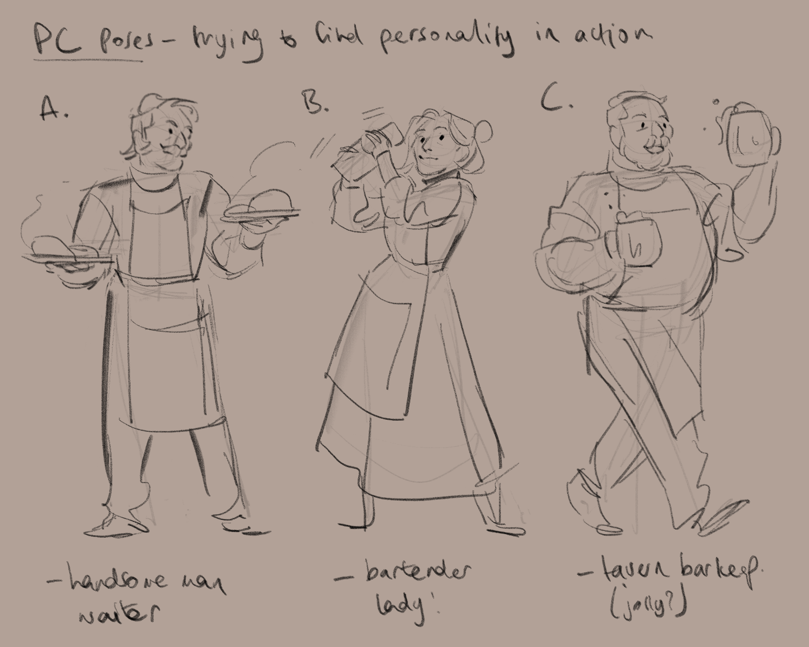
zooming out a bit – trying to find the vibes in body language and overall shape rather than faces (you can see where I started to get frustrated in the second image)
When I started to flounder, I switched gears and decided to go girl first. This turned out to be my way through. Taking warmth and mischief as my defining characteristics and putting them into a feminine design was just different enough for things to click in my brain.
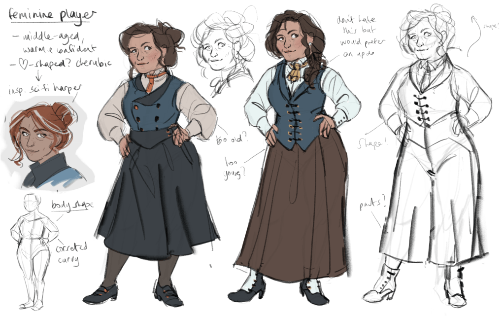
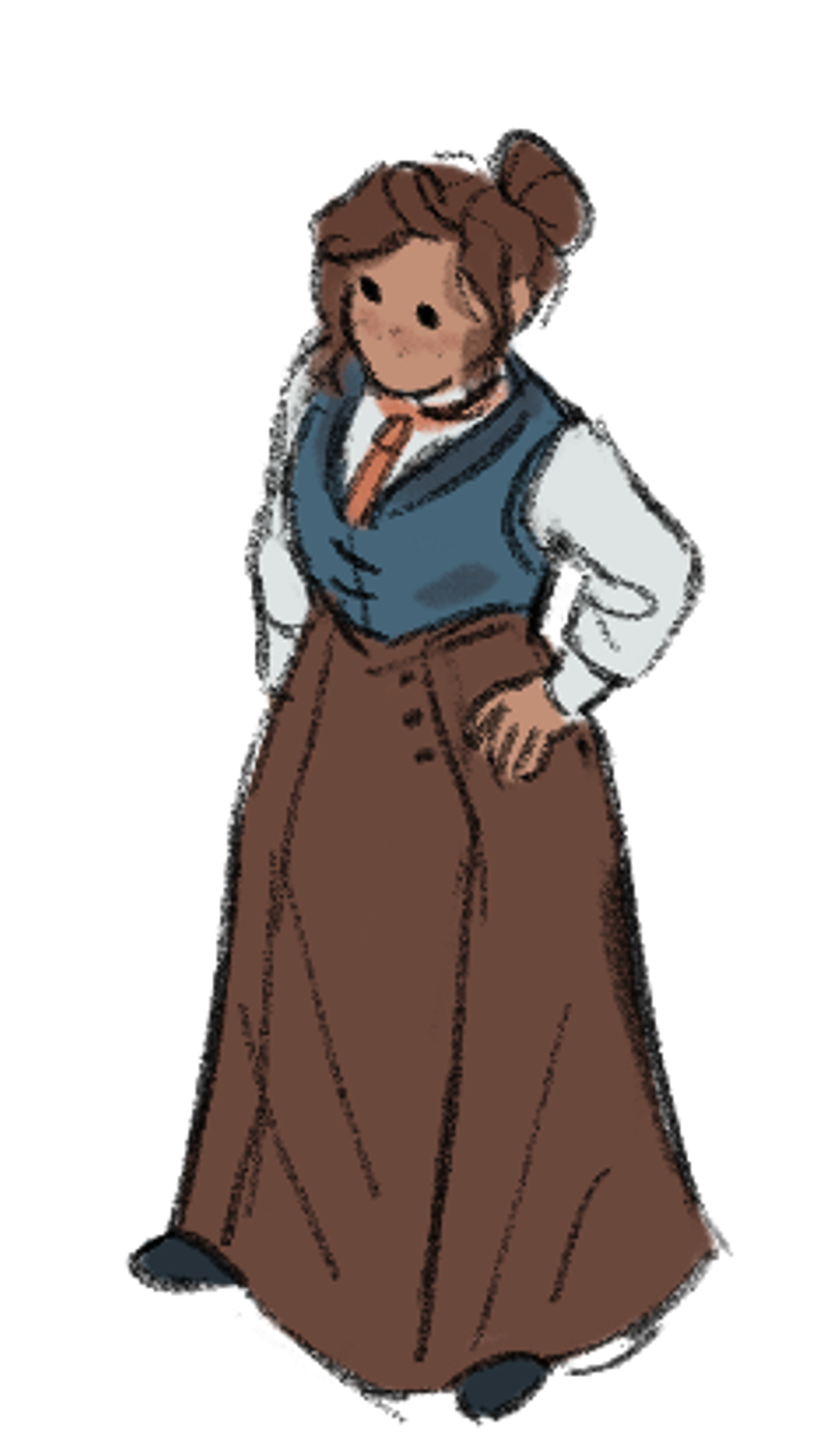
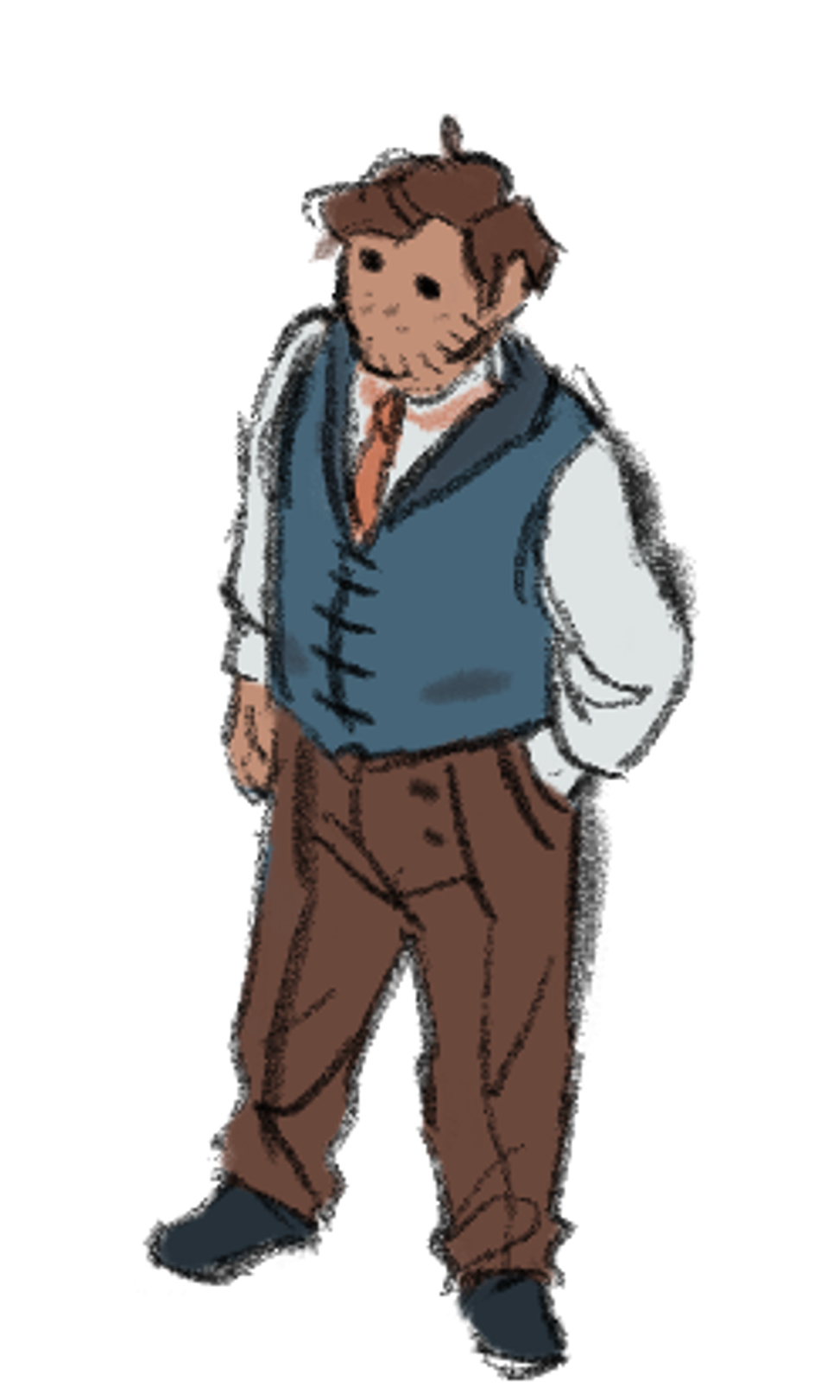
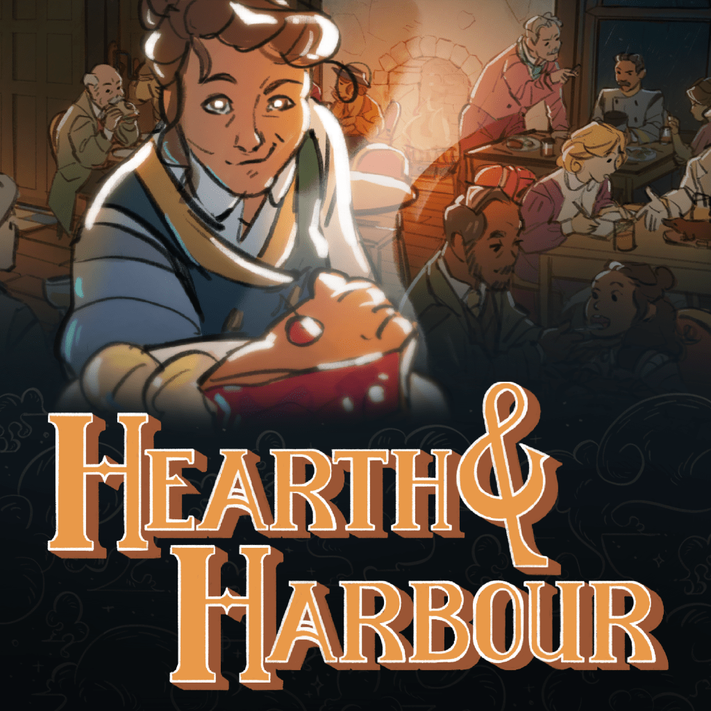
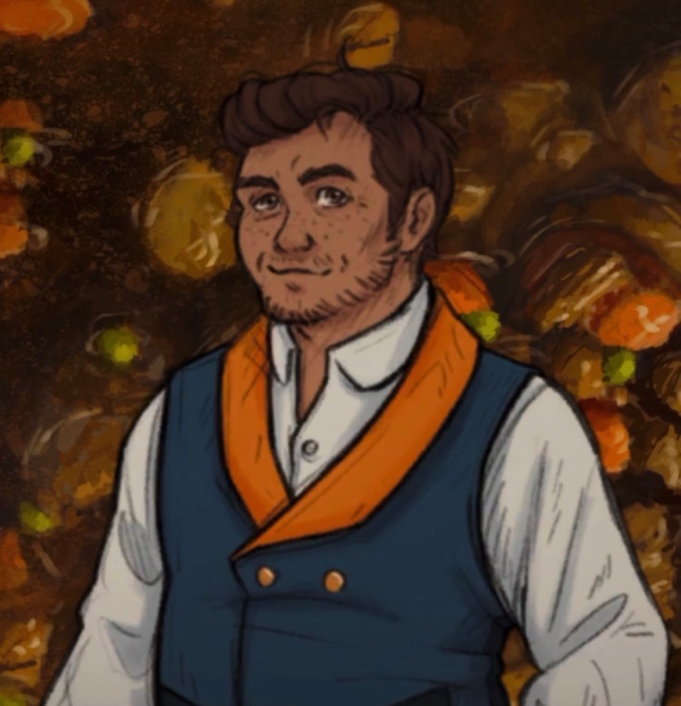
In these first ‘final’ versions of the design, I finally felt like I knew the important elements. Kit is made out of hearts (serendipitous given how hearts have come to represent favour, your ‘relationship’ stat in the game!) – in shape language terms this means I can use roundness (soft, friendly, approachable) and sharpness (active! alert! edgy!), with lots of curves to bring it all together. I kept them handsome, but pulled them away from the (Eurocentric) contemporary beauty standard of very slim and very pale. I used warm colours for hair, eyes, skin and clothing, with blue for contrast against all the brown, and to help the orange accent colour pop and keep them visible on screen (wooden floors, bricks and cobblestones are all brown!). They’re a little scruffy, but not so much that they feel incompetent – just maybe a little overworked. I think they have charm and whimsy!
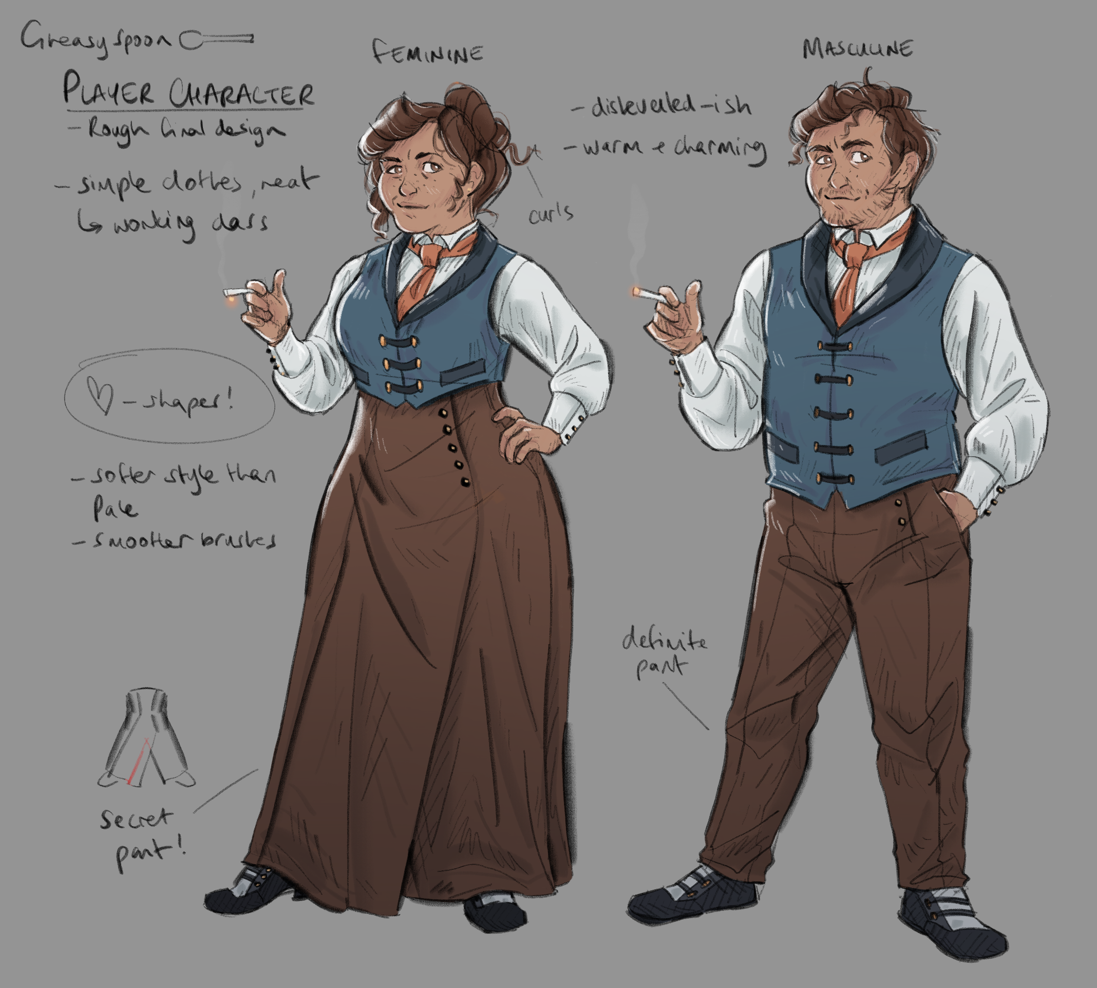
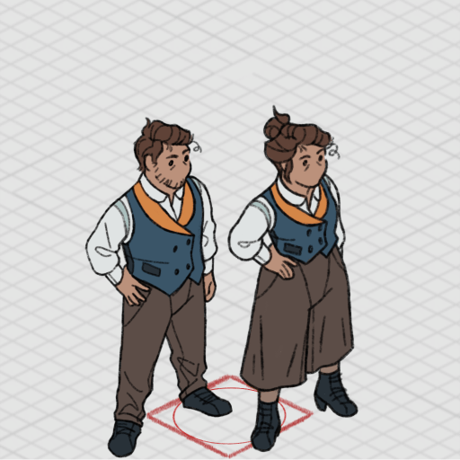
The first ‘final’ conversation and isometric designs of Kit Purcell
Streamlining them for animation was a chance to push the design a little further, refining the shapes to look good moving. Around this time we were also locking in the design for key art ahead of announcing the game. This was when I had to pick one to be brought to the forefront. We likely only had time to animate one of them before release, and we can’t put a character you can’t play as all over our Steam page.
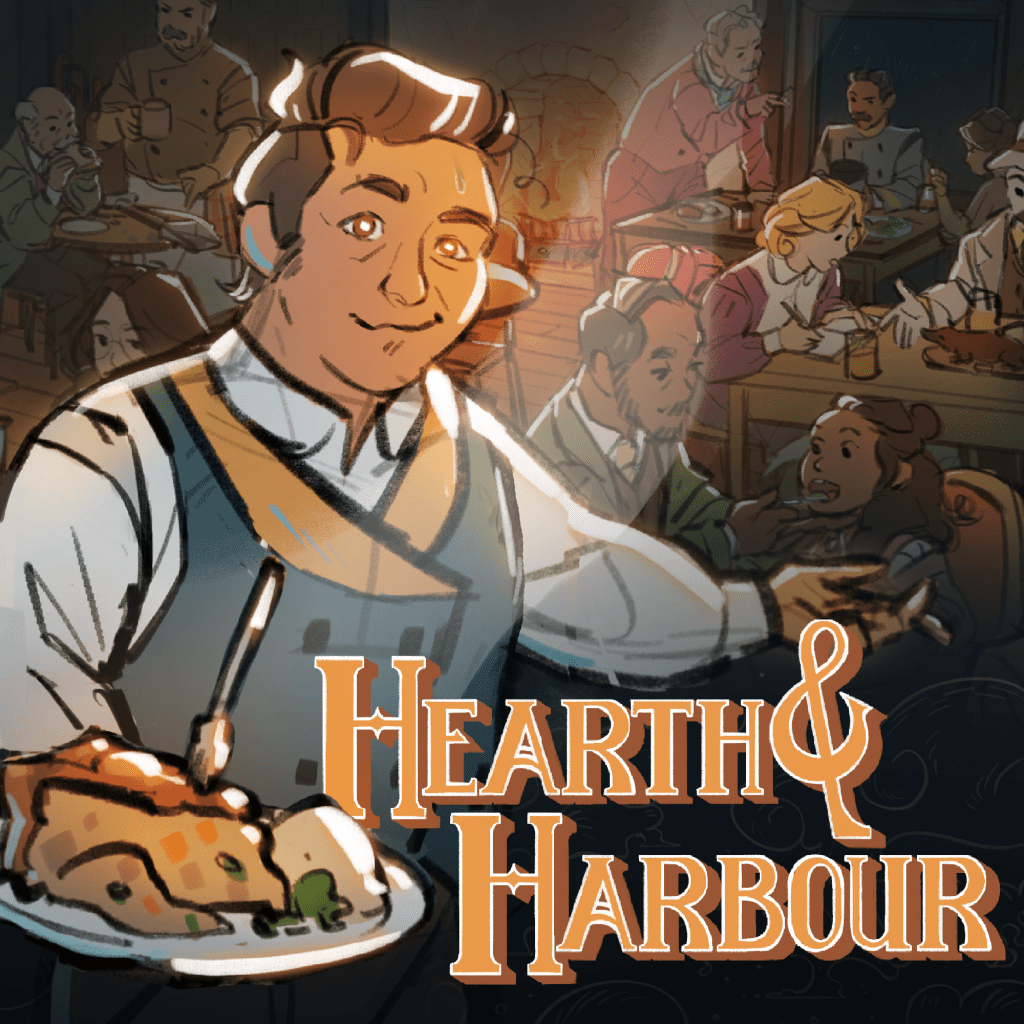
I felt masculine Kit was a slightly better mascot for the game (and slightly easier to animate), so that one won. For now (FOR NOW!!), they’re our only player character for The Hearth and Harbour.
I occasionally get messages from people who have played The Pale Beyond, and seen themselves in it – whether in Shaw, or in the rest of the crew. It’s incredibly meaningful to me that we created something that feels welcoming in that way. The responsibility is still there in this game.
Since Kit was designed, it’s been added that they’re an immigrant in the story of The Hearth and Harbour – this had always been an option, but we’ve now centred it. Kit escapes their home country and travels to Lewthport, and the war that was bubbling back home threatens to follow them (wow a war in the 1910’s I wonder what that could be). By defining Kit, we’ve been enabled to be a little more specific with the narrative, and maybe ask some players to empathise with someone they otherwise wouldn’t have.
Ultimately, I’m not sure if I landed on the right player character design or not. I’m mostly happy with how it turned out, I feel the elements I wanted to get in there do come across in the final version. That guy looks warm and mischievous, and hopefully not too boilerplate. But at the end of the day, it’s up to the player if they feel they can roleplay as Kit, or if they can’t. So far the community seem positive, so I’m taking that as a good sign. I’m sure it will affect the gameplay in ways we don’t expect. I’m excited to find out how.
All this to say… please make Kitsonas. When the game comes out and you play it and love it, please make your own version of Kit and post them online for me to see. Thank you.
Love from,
-Jess (Art Director)
PS. If the game does well, I’m still holding out on being able to scrape together a feminine player update post-launch. Please buy the game so I can do that.
FANART FEATURE:
This month, the featured fan art is by ME!!! A cute piece of Cordell doing the hard levels for some of the younger Temperance crew members, created to celebrate the physical edition of The Pale Beyond on Switch. It was inspired by one of my favourite memes in the whole world.
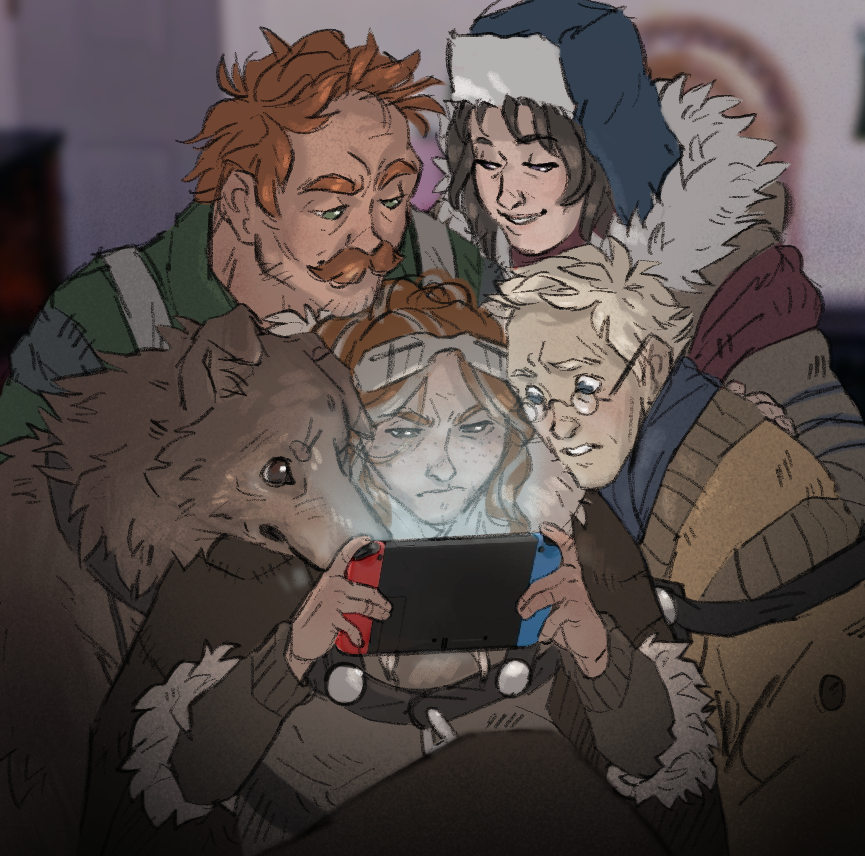
Artist: Jess
If you would like your work featured on our blog and social media, contact our Art Director:
Email: jess@saltstonestudios.com
Discord: jessanight
Thanks so much for your support, from The Pale Beyond to The Hearth and Harbour, and hopefully, beyond.
